

Every Illustration is a puzzle
Every Illustration is a puzzle
What to check for if an illustration feels off.

Dear Reader,
Today I want to talk about annoying illustrations. The ones that leave you stomped and frustrated and how you can potentially fix them.
Troblesome Illustrations
I have one of those right now. I can’t seem to make work to my satifaction.
This is the status quo I left it at yesterday evening and believing I was done, but opening it today I was dissatisfied and had the feeling something is still off.

When something off in an illustration it is good to go through this checklist:
What are my most impostant elements? And are they being framed and emphasized?
Are my values okay and supporting my important elements?
Is the saturation balanced and supporting the important elements?
Can I emphasize my elements with a cool/warm contrast even more?
The shapes/sihuettes interesting ennough?
Flip the image to see mistakes better
This list probably isn’t complete but can catch some of the common problems an illustration can have that are easily fixable.
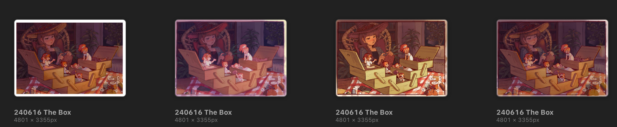
This is the state I settled on after a few rounds of editing. I decided that desaturating the background while lightening mainly the forground some more would have the desired effect, but who knows… xD I might feel differently tomorrow . It’s just one of these illustrations.
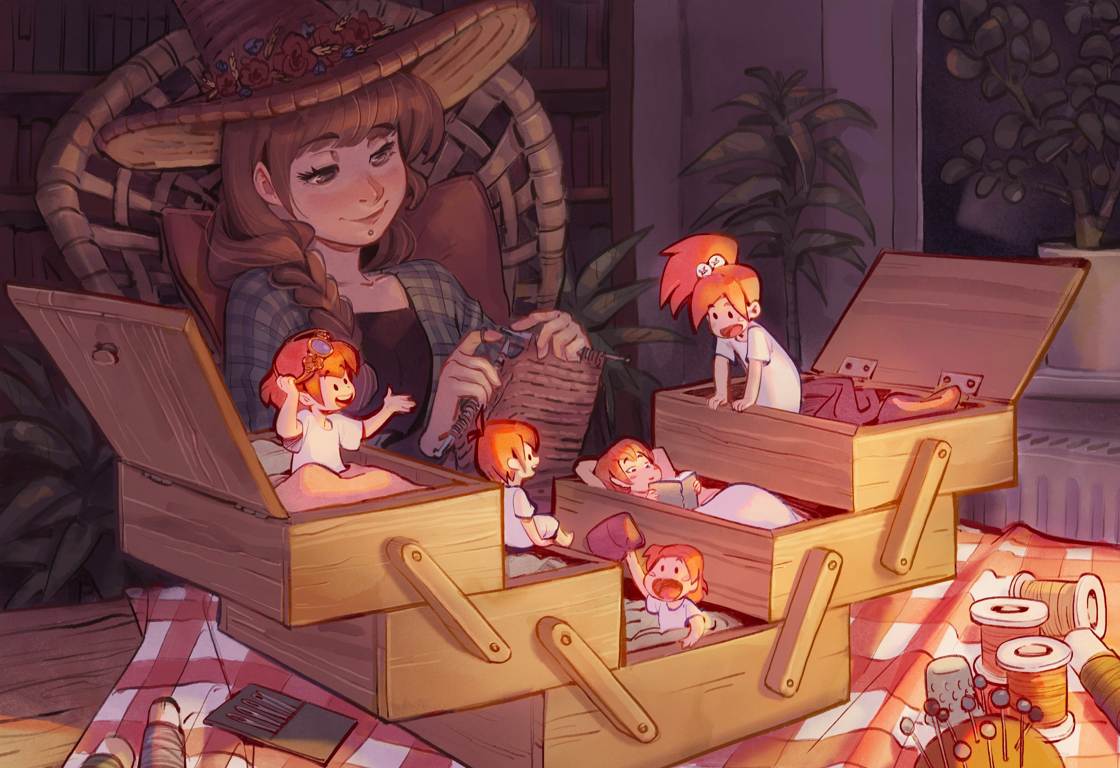
Each illustration is a puzzel with a bunch of variables that need solving. This one for me is/was rather high level.
I have perspective, a bunch of characters, Lineart that needs to be incorporated into the painting, extreme lighting scenario interacting with local colors and an inside scene which I rately do and now realize I have problems with.
Here the lighting in tems of colors was trickiest for me. I find lighting inside rooms much harder than outsides scenarios since I practiced those a bunch and I have my methods and workflows that I know work most times.
My aproach here was to give everything it’s local colors and then add a lighting scenario on top.
I tested a bunch of color temperatures and modes back and forth to find a good method to light my room.
I now know → I find it very hard to make “color dodge” work and that “hard light soft light and screen” work better for me.
I also asked other artists about their workflows. If they start with lokacl colors and then light the scenes. Nerding about artwork flows is such fun!
It’d probably make sense to keep going and keep testing with a bit simpler scenario. Even though it was hard and I’m not completely happy with this illustration, I don’t deem it a waste of time. I will get a handle on inside lighting to my liking at some point x) next illustration inside will probably go smoother. Fingers crossed!
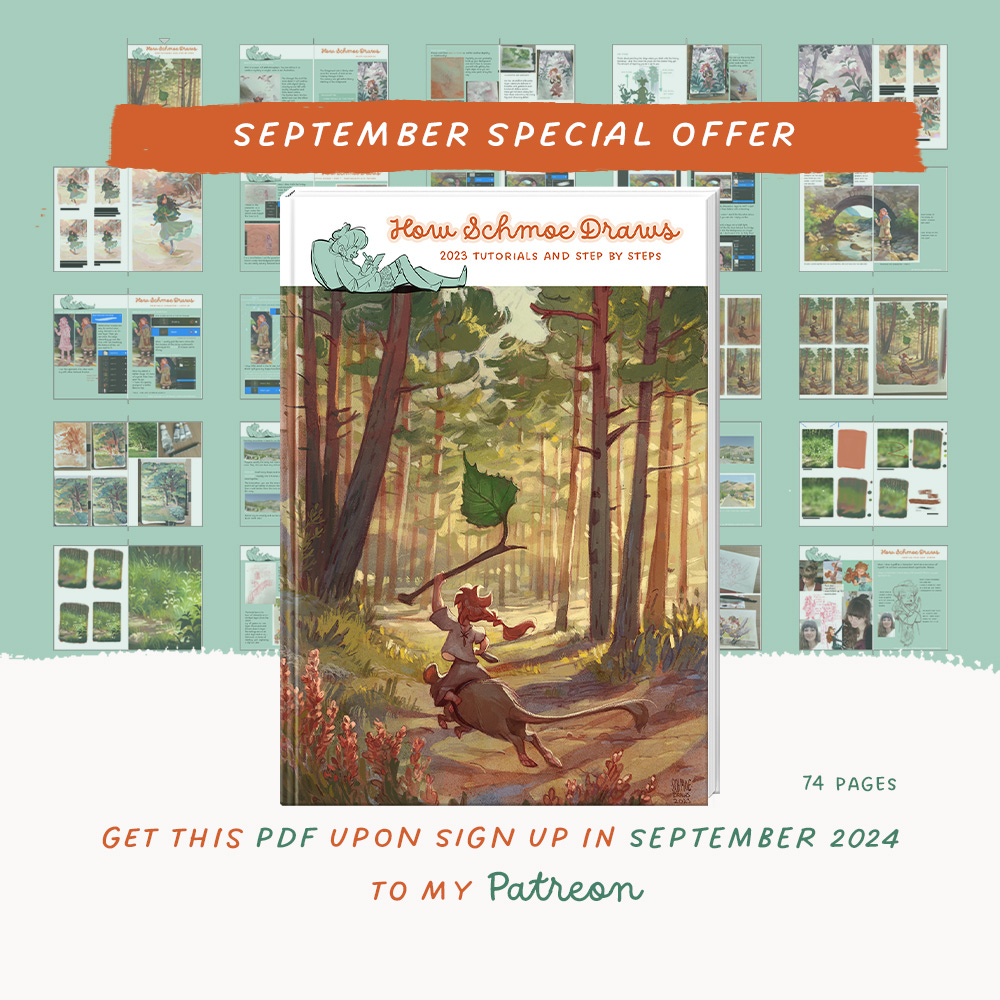
A happy little accident
In August I was giving away this PDF on my Patreon but this promotional grafic I posted on my socials spoke of a Special September Offer … well… So I decided to do what my grafic says and this PDF still is a bonus one gets upon sign up to my Patreon in Spetember :D
WEEKLY PRACTICE

Lizards are so weird, but cool!
Here are some of yours<3


miekagiart, daphne.rozemond.art, bubblemunkee ,artbykellyb
This weeks practice will be Mice: references
Will you participate again this week? :D
If so tag me on Instagram. I will share some in my stories and here <3 #schmoescosyartclub
Love,
Schmoe <3
dear schmoe, i think perhaps your art (which is absolutely amazing!) seems a little bland to you because the color scheme is fairly monotone. perhaps consider making either the background or foreground cooler? that may make the foreground pop a bit more. just a thought :)